OnlyFans Link-in-Bio Pages: A Practical Guide to Conversion and Tracking
Create a clearer link-in-bio page, organize campaign links, test the mobile journey, and measure useful outcomes without confusing clicks with subscribers.
Affiliate disclosure: This article includes affiliate links. OFToolbox may earn a commission from signups through those links. Examples are illustrative and do not represent measured conversion results. See our affiliate disclosure.
Your link-in-bio page sits between attention and action. Someone has seen your content, opened your profile, and decided to learn more. That is already a sequence of choices. The landing page should make the next choice clear instead of asking the visitor to decode ten buttons, an unfamiliar brand name, and a vague promise.
For OnlyFans creators, a good page combines recognizable branding, accurate expectations, suitable destinations, and a sensible measurement routine. Visual polish helps, but clarity matters more. A visitor should understand whose page they are on, where the main button leads, and whether the offer matches what brought them there.
This guide covers page structure, tool selection, campaign naming, mobile testing, and interpretation of results. Browse the link-in-bio tool directory for options, and treat every proposed feature as something to verify against your actual traffic sources and the provider’s current terms.
Give the page one primary job
Start by writing the action you want an interested adult visitor to take. It might be visiting your subscription profile, reading an introduction, or choosing between two distinct platforms. Avoid turning a single-purpose promotional page into a complete archive of every account you have ever opened. More destinations can create more uncertainty rather than more opportunity.
Decide which links are essential to that primary job. Put the main destination first and make its label specific. “Visit my OnlyFans” tells a visitor more than “Unlock the secret.” Supporting links should have a clear reason to exist, such as another active subscription platform or an official contact route.
Remove abandoned destinations. A broken shop, inactive profile, or old offer makes the whole page feel less reliable. If a link must remain for archival reasons, label it accordingly and move it away from the main action. The page should reflect the business you operate now, not a history of every experiment.
Match the page to the source of traffic
A visitor arriving from a short introductory video may need different context from someone following a detailed recommendation. You do not necessarily need a separate page for every source, but your headline and button labels should remain consistent with the promises in the content that sends people there.
Use the same recognizable creator name, profile image, and general visual identity where appropriate. Avoid making a visitor wonder whether an account was compromised because the landing page looks unrelated to the profile. Consistency reduces the work required to establish that the destination belongs to the creator they intended to visit.
Keep promotional claims accurate across the journey. If a social post mentions a particular offer, verify that the landing page and destination explain the same offer. Do not use an old price in a pinned caption and expect the visitor to infer that the details changed. Clear information supports better decisions and fewer disappointed arrivals.
Build a mobile layout before decorating it
Most link-in-bio journeys are experienced on a phone, often inside an app’s browser. Design for a narrow screen first. Put the creator identity, a short explanation, and the main action near the top. A large decorative banner should not push the useful information several screens below the fold.
Use comfortably sized buttons, readable text, and enough space between destinations. Make link labels distinct, and avoid relying only on icon shapes that some visitors may not recognize. Check text contrast against your chosen background. Blue can feel familiar and trustworthy, but pale blue text on white may still be hard to read.
Compress large images and limit unnecessary animation. A page that feels lightweight on a fast desktop connection can behave very differently on mobile data. Keep the design flexible enough for longer names and translated labels. Layout should help the reader make a choice rather than demand attention for its own sake.
Compare tools against the job you defined
Create a short comparison around the features you actually need: custom branding, clear link management, analytics, accessible templates, ownership controls, and export options. Ask whether useful features require a higher plan. Check what happens to your public page if a subscription lapses or you stop using a particular custom domain.
GetAllMyLinks and solo.to are affiliate-linked options already listed in OFToolbox. Evaluate their current offerings alongside alternatives in the directory. A referral link does not establish that a product is the best fit for your audience or budget.
The GetAllMyLinks website describes landing pages, direct links, link management, and analytics. It also markets browser-routing features. Test any such behavior on your actual devices and traffic sources; do not treat a vendor’s conversion claim as a forecast or assume a routing feature guarantees compliance with a social platform’s rules.
Keep the visitor’s journey transparent
A redirect should take the visitor where the label says it will. Avoid deceptive intermediate pages, misleading button names, or different destinations designed to hide prohibited activity from a platform. A clear page is easier to maintain and gives visitors a better basis for deciding whether they want to continue.
If a destination involves a paid subscription, make that context understandable. Your link page does not need to reproduce every term from the destination, but it should not imply that paid access is free. Similarly, do not describe an unofficial contact account as customer support for the subscription platform itself.
Review the rules of both the traffic source and the link-page provider. Technical availability does not imply permission for every kind of content or destination. If a channel restricts a particular link, adapt your permitted promotional approach. A tool should support an authorized journey rather than become a reason to ignore the underlying rules.
Create campaign names before you create links
Tracking becomes easier when names follow a pattern. Choose a source, medium, campaign, and optional content label. Keep the values consistent: instagram, social, autumn_intro, and profile_bio are easier to reconcile than a mixture of abbreviations, spaces, and improvised names. Document the convention where anyone publishing links can find it.
Use campaign names that describe the promotion without identifying individual visitors. Do not put subscriber names, email addresses, private account details, or other personal information in URLs. Links can appear in browser histories, screenshots, logs, and forwarded messages. A useful campaign label should remain safe when someone else sees it.
Avoid assuming that tracking parameters will survive every redirect. Test the complete path from the original profile to the final destination. Where the platform provides its own supported tracking links, understand what those reports measure and how they relate to your landing-page analytics. Different systems may describe different steps of the journey.
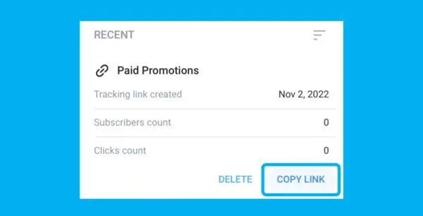
Existing reference image from the OFToolbox library. Use the definitions and controls in your current platform interface when setting up reports.
Know which number answers which question
A page view tells you that the landing page loaded according to the analytics system’s definition. A button click indicates an interaction with a destination link. Neither automatically means that a visitor subscribed or paid. Keep those events separate when reporting results, especially if different tools count repeat activity differently.
Write a small measurement dictionary. Explain what counts as a visit, a unique visitor where available, a destination click, and a subscription attributed by a supported platform report. Include the reporting time zone and any known limitations. This prevents a team from comparing incompatible numbers and calling the difference a conversion problem.
Choose a question before opening the dashboard. “Do visitors find the main destination?” can be investigated with page interactions. “Does this campaign produce retained subscribers?” requires a different source and a longer observation period. A useful report connects a measure to a decision instead of presenting a large collection of impressive-looking totals.
Use simple calculations carefully
Suppose a fictional campaign produces 400 landing-page visits and 100 main-button clicks. The observed click-through proportion is 25 percent for those recorded events. That does not imply a 25 percent subscription rate. It describes the movement between two measured steps, with whatever counting limitations the analytics provider has.
If a supported destination report attributes eight subscriptions to the same campaign, document the attribution method and time window before combining the figures. Some visitors return later or use a different device. Others open the page more than once. Exact person-level matching may be unavailable, and pretending otherwise creates false precision.
Use the calculations to guide a practical investigation. A page with many views but few destination clicks may need clearer labels or fewer distractions. A page with healthy click activity but weak subscription results may have an offer mismatch. Neither observation proves the cause; it suggests where to look next.
Test one meaningful change at a time
Begin with a clear hypothesis. For example, replacing an ambiguous button label with the platform name may help visitors understand the destination. Keep the rest of the page stable while observing the change. If you also replace the imagery, alter the offer, and switch traffic sources, interpretation becomes much harder.
Small accounts often have limited traffic, so avoid declaring a winner after a handful of visits. Consider the source mix, day of week, and whether a particular promotion created unusual behavior. You do not need elaborate statistics for every routine edit, but you should recognize when the evidence is too thin to support a confident conclusion.
Keep a change log with the date, hypothesis, previous version, and observed result. Record inconclusive tests too. Over time, this becomes a useful history of what your audience appears to understand. It also stops a new team member from repeating a failed experiment simply because nobody remembered why the old design changed.
Check the full mobile journey regularly
Open the source profile, tap the bio link, and continue to each important destination. Test on more than one device or browser where practical, including an in-app browser used by your audience. Watch for broken layouts, unexpected prompts, missing images, and destinations that fail to load.
Check whether the back button behaves reasonably and whether redirects introduce an unnecessary loop. Review the visible domain at each step. A confusing chain can undermine confidence even when it technically reaches the right page. Shorter, clearer journeys are also easier to troubleshoot when someone reports a problem.
Repeat the check after changing a custom domain, replacing a destination, or updating a major offer. Assign an owner for routine link maintenance. A simple monthly review can catch an expired page or stale button before it remains broken for an entire campaign. Keep a record of the last successful check.
Build a reporting routine you can sustain
Review results on a regular schedule rather than reacting to every hourly fluctuation. Compare like periods where possible and note unusual events. A collaboration, a platform outage, or a new source of traffic can affect the numbers enough that a simple week-over-week comparison becomes misleading.
Use a short report with the main sources, destination interactions, supported subscription outcomes, and one next action. Keep operational observations beside the numbers: a confusing offer, a failed redirect, or a missing mobile crop may explain more than an isolated percentage. Reports should make the next decision easier, not require another meeting to interpret them.
As your operation grows, decide whether reporting belongs in a CRM workflow or a simple spreadsheet. Keep the underlying definitions consistent either way. Moving a chart into another tool does not improve measurement unless the collection and interpretation are also clear.
Keep ownership of the page understandable
Record who controls the page account, the custom domain if you use one, and the recovery email. If an assistant manages links, give them only the supported access required for the task. A public page can become business-critical even when it began as a quick experiment, so its ownership should not depend on an informal arrangement nobody documented.
Keep a simple backup of the current link labels and destinations. This can be a short document rather than a technical export. If you need to move providers, you should be able to reconstruct the essential page without relying on memory. Check that the replacement preserves clear destinations before updating the links on your public profiles.
A clearer page is a better starting point
You do not need a complicated funnel to improve the experience. Begin with recognizable branding, a truthful description, a prominent main destination, and working links. Add measurement that answers a real question. Then refine the page using observed behavior while acknowledging the limits of the data.
If maintaining links and campaign records is taking too much time, use the content workflow automation guide to organize approvals and updates. For a broader view of what deserves a place in your business, read the lean creator tool stack guide. The objective is a trustworthy, understandable journey that you can keep working over time.
If you enjoyed this post, please help us by sharing it with others.
Build a repeatable creator workflow with content batching, approval gates, asset organization, and practical automation around your publishing process.
06 Oct 2026 • 12 min read
Build a focused creator tool stack with a buying checklist, subscription audit, practical workflows, and a staged approach to adding software.
24 Oct 2026 • 12 min read
Organize creator account security with stronger logins, controlled team access, safer file sharing, recovery planning, and a practical monthly review.
18 Oct 2026 • 11 min read